I am pretty cheap when it comes to photographing our family camping excursions. My Cannon point-and-shoot is a decent camera, but when it comes to shooting in low light conditions, or my biggest challenge – shooting good landscapes, the limitations of this kind of camera are clearly evident in the marginal pictures it produces (not me, of course – the camera!).
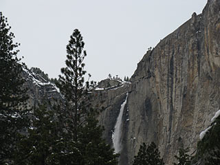
Original photo of Upper Yosemite Falls
I have been using various version of Photoshop Elements for many years. I am definitely not a “power user†and probably do not make use of even half of what this program is capable of. As a blogger and the unofficial family photographer, however, it’s one of my most-used software applications.
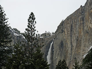
Same photo, after applying Auto Smart Fix
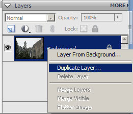
Right-click on the background layer and create a duplicate
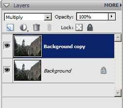
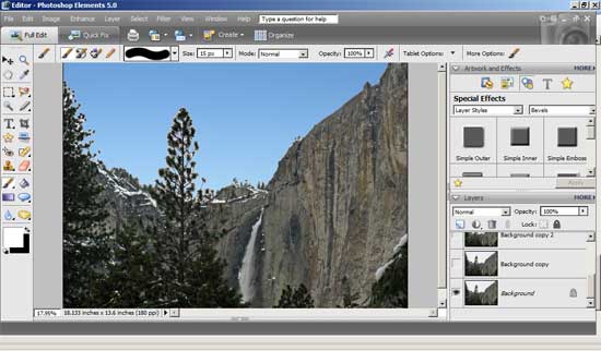
Change the layer blend mode to Multiply
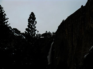
Multiply mode creates a better delineation between the terrain and sky
Creating new background layers in Multiply mode darkens the contrast, which makes it easier to select the washed-out sky from the now darkened terrain. I used three Multiply layers, here, in order to get the contrast high enough. Don’t worry, we will turn these layers off once we drop-in the new blue sky.
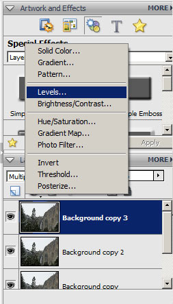
Create a Levels Adjustment layer
Here is where things start to heat up. I create a Levels Adjustment Layer above the top background layer and accept the default levels in the resulting dialog box. Now I open my handy blue sky photo – I keep several images of the sky stored, just for these occasions.
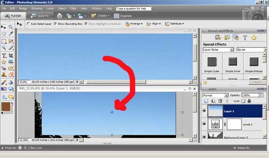
Drag the image of the blue sky onto the photo
Dragging the blue sky image on top of my Yosemite Falls image creates a new layer above the Levels Adjustment Layer (Layers box in the lower-right corner). Next, just move the blue sky around until it completely covers all of the washed-out sky in the original photo.
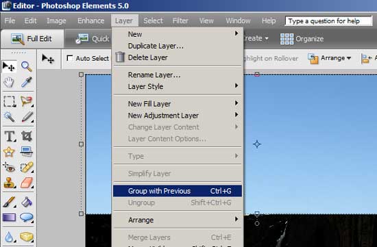
With the blue sky layer selected, click Layer and Group with Previous
Now group the new blue sky layer with the Levels Adjustment Layer, created above. This creates what Photoshop calls a Clipping Group – in laymen’s terms it will apply the blue sky in this layer, to sections of the original photo that we carve-out in the next step.
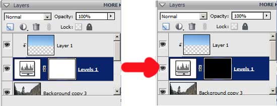
Invert the white color on the Adjustment Layer with Ctrl I
Up to this point, I have a darkened image with a big blue box over the top of it. The last step before replacing the washed-out sky with my new blue sky is to invert the white background on the Levels Adjustment Layer to black, by selecting it in the Layers box and hitting Ctrl I (Invert).
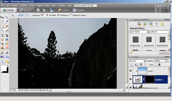
Using the Magic Wand to select the washed-out sky
Once I invert the Adjustment Layer, the blue sky layer disappears, revealing the darkened Yosemite Falls layer, below. Now I can use the Magic Wand tool to select as much of the washed-out sky that I can. I cannot get every little bit of it, because of the intricate tree branches, but hopefully enough so that the final image will look realistic.
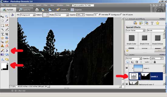
With the Adjustment Layer selected, fill the washed-out sky with white using the Paint Bucket tool
Here is where all the Adjustment Layer and inverting comes into play; select the Adjustment Layer in the Layer box and use the Paint Bucket tool to fill the washed-out sky with white – poof! The washed-out sky instantly disappears to reveal the blue sky layer.
The new image, after turning off the Multiply Layers
With the blue sky in place, the original background image is restored by turning off (clicking the “eye” next to each Multiply layer in the Layer box) the various Multiply Layers.
The end result is a much better picture and, in this case, one that is a much better representation of the cold, clear day that we spent in Yosemite. This photo just might find itself on this year’s Christmas Calendar!

Excellent tutorial! The only thing I might add however is that these days, our smartphones have some amazing camera capabilities already built-in. Not that I’m suggesting any fellow campers stay plugged in and on the grid while out there (reception will likely be nil anyhow) BUT considering most of us carry our phones with us all the time anyway…with all the optical lens accessories available now for our cellphones, the photographic possibilities are endless. Like they say, the best camera you have is the one that you actually have with you.
Also, if you have a Mac iPhoto’s “Enhance” feature is quite nice. Usually that’s all I need (I too use a cheapo point and shoot) but if you want more then there are many easy to use color/contrast controls as well.
Great tutorial. That’s a tricky but useful edit.
There’s also free software with similar functionality – I edit and watermark my photos with Gimp (www.gimp.org). The trade-off with these programs is they’re usually harder to install and not as user-friendly as Photoshop.
Wow- I’m impressed. I have Photoshop and I know I need to dabble even more in it. I can edit and digital scrapbook with it but mixing part of one photo with another is tough stuff. Looks awesome!
Whatever happened to just stealing from Google images and calling them your own shots? Sheesh…take all the fun out of camping! (Yeah…I MIGHT be back…)
Thanks for the tips Roy. I’ll have to check out Photoshop Elements for our camping trips this year. We bought a Kodak Zi-8 video camera for taking quick videos in HD and it takes pretty good photos in low light. I’m planning to take a lot of videos and photos this camping season.
Thanks for the step-by-step tutorial. I see all those buttons in Elements but don’t quite know what to do with them. I appreciate the post!
You are welcome, Linda!
Great article. Go to http://camping.in-theusa.org and become a contributer to that site.
Hey Roy –
Thanks for the tips. My photos are traditionally mediocre at best, but I just downloaded Picasa and are learning just the basic editing for now.
Eric
Mine too, Eric 🙂 What I lack in skill, though, I try to make up for in volume (in hopes that a few will turn out decent) 🙂
Thanks so much for this great post! Love your blog, but never commented before. I am also a “light” photoshop elements user…but never ventured beyond the standard contrast/exposure/cropping functions. I’m going to try some of the features you highlight here!
Thanks again.
You’re welcome! That is exactly how I used Elements, for a long time, but I am interested in learning more about its potential.